How to Create Email Templates
Templates help you send consistent, branded messages to your patients for different events, such as order confirmations or subscription renewal reminders.
In our system, templates are typically used within workflows, which determines when and why the template is sent. You can also use templates to send email campaigns through the CarePortals CRM.
To learn more about workflows, see the The Workflow Automation Engine guide.
In this guide, we will focus specifically on building an email template. We will use an Order Confirmation email as our main example. However, you can create templates for any message that you need to send.
Step 1: Create your template
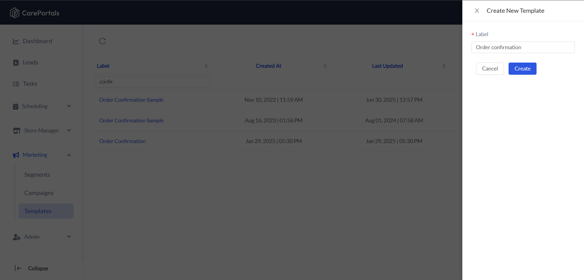
Navigate to the Marketing section in the CRM portal and select Email Templates.
Click the Create Template button to open the editor.
Give your template a clear a n d descriptive name. This name is for internal use and helps you identify the template later when building workflows.
Click on Create. You can start building its content using the Email Template Editor.
The editor offers drag-and-drop and design tools that give you full control over the look and feel of your templates. It is divided into a central canvas, where you build your template, and a left-side panel with three main tabs:
Structure: Drag and drop blocks to define your message layout.
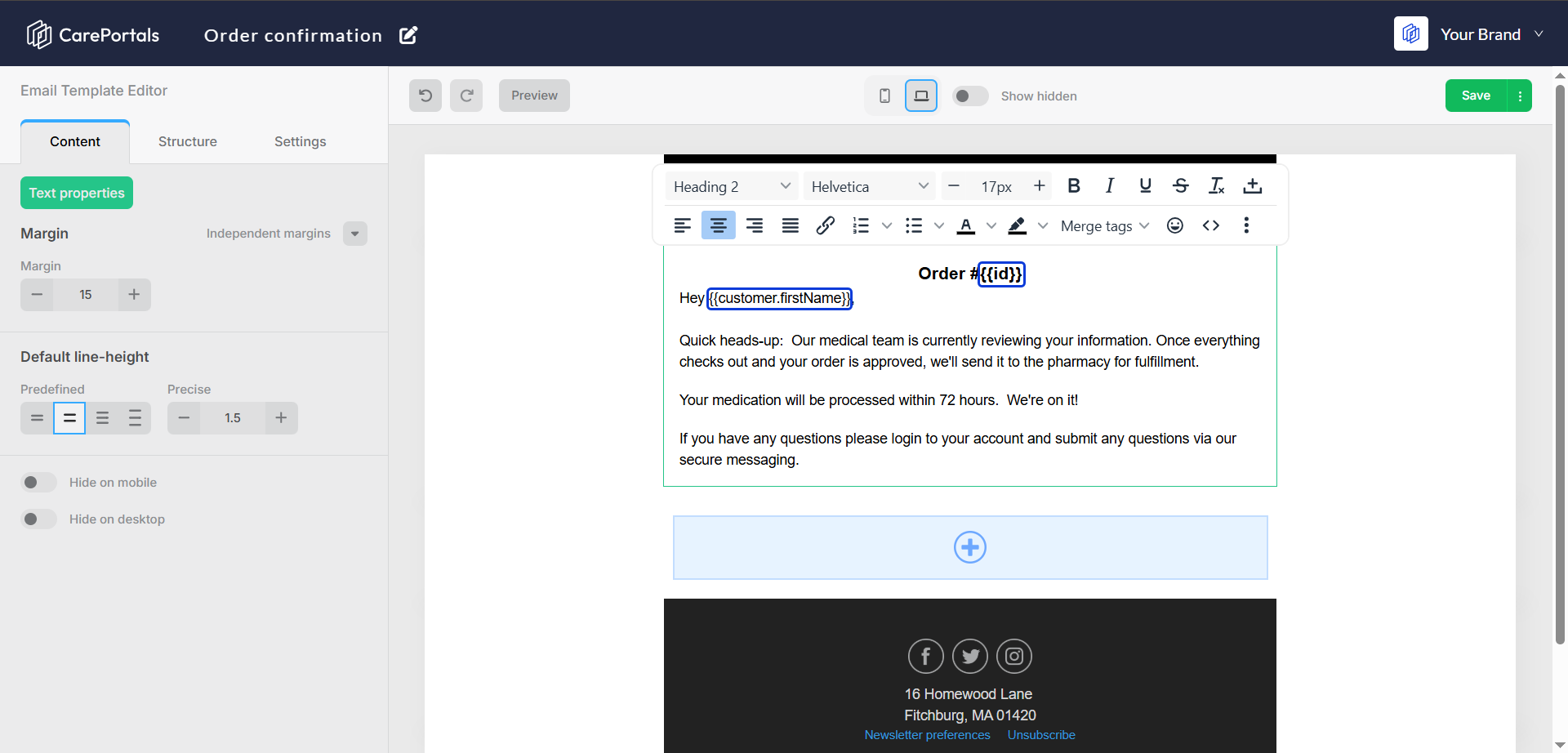
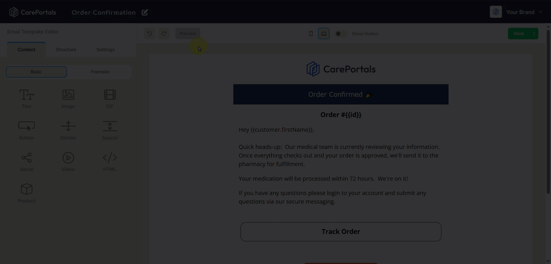
Content: Use this tab to populate the structure with content blocks like text, images, and buttons. You can also use dynamic variables (e.g.,
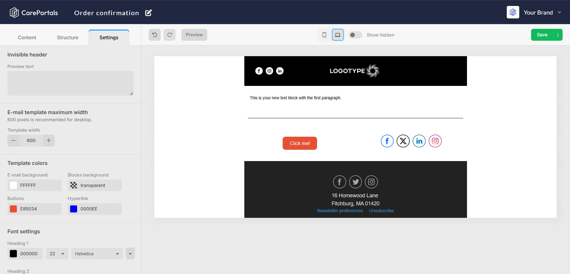
{{ customer.firstName }}) to personalize your message.Settings: Define your brand’s look and feels, setting global colors and fonts.
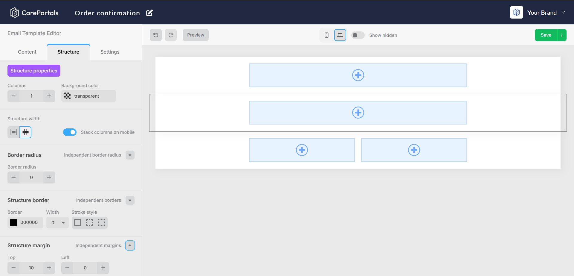
Step 2: Define the Layout
Before adding content, it's best to define the layout of your email.
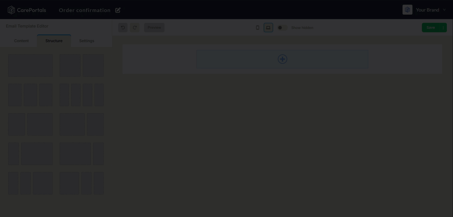
Click the Structure tab in the left-side panel. You will see different column layouts.
Drag and drop the structure you want onto the main canvas. For example, you can choose a single-column design for a header and a two-column design for a product and its description.
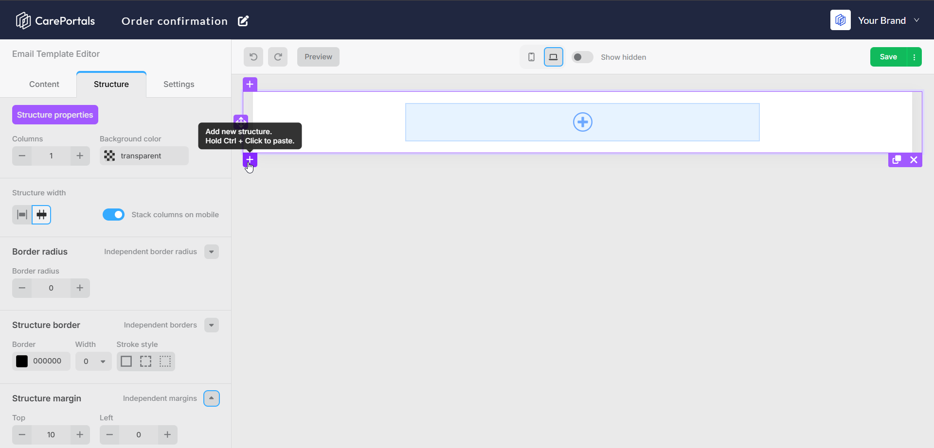
As an alternative, to add a new structure to the template, click on the plus icon (+) on the left corner of a structure. You can insert one above or under it.
Step 3: Add Content
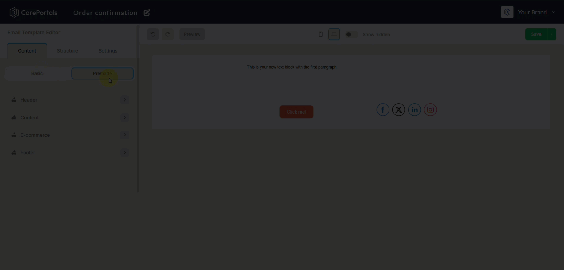
Once you have a structure in place, you can add your content by dragging components from the Content tab onto the canvas or directly by clicking on the plus (+) icon within a structure section. The content blocks are organized into two types, Basic and Premade.
Basic Components
Basic components are individual elements that you can combine to build your email from scratch. The following table list the components available and describes when to use each one.
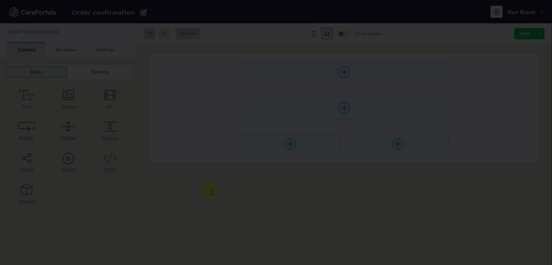
Premade Components
Premade components are pre-designed, multi-element components that help you build professional-looking emails more quickly. The following table list the components available and describes each one.
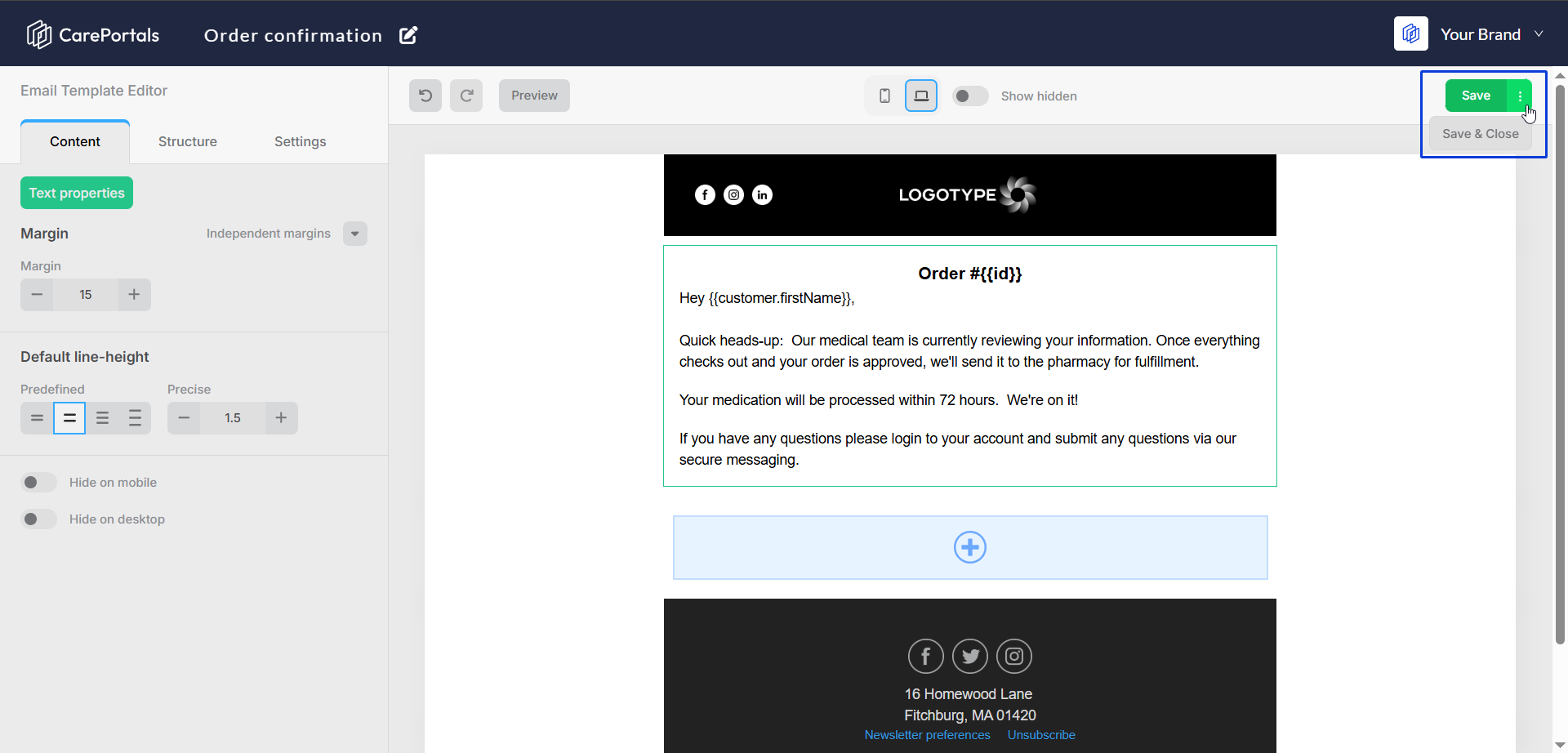
Every block you add is fully customizable. You can click on any component to edit its properties, from changing a button label to adding your social media links or uploading your brand’s logo, among many other customization options.
Use Dynamic Variables
Dynamic variables let you personalize emails with patient data from the triggering workflow, ensuring each message is tailored to the recipient. For example, in an order confirmation email, you can use a variable like {{ customer.firstName }} to automatically insert the patient's first name.
The dynamic variables you use must exist in the data source (payload) of the workflow trigger. If you use a variable in a template that is not available in the trigger's data, the email will be sent, but the variable will appear as plain text instead of being replaced with the corresponding (patient’s or order’s) information.
You can check the Trigger Events Payload Index page for an overview of trigger event payloads and their parameters, including JSON examples for each event.
Step 4: Adjust the Settings
The Settings tab lets you adjust the overall appearance of your template to match your brand. By setting these global styles first, you ensure every part of your template, from the background color to the text, automatically aligns with your brand identity.
Using the available Settings configurations also guarantees a professional and uniform look across all emails sent with this template, helping build trust with your patients.
Here’s a breakdown of the key settings you can control:
Step 5: Test Your Template
Preview your template at any time to see how it looks before sending it. You can also send a test email to check how it will appear in an inbox.
Click Preview. You can view both the desktop and mobile versions of your template.
Enter an email address in the Send test to field and click Send. A test version of the email will be delivered to that inbox.
To return to the editor, click Switch to Edit mode.
Step 6: Save Your Template
Once you are happy with your design, click the Save button in the top-right corner. Your new template is now ready to be used in your automation workflows.
Once you are happy with your design, you can save your work using the options in the top-right corner of the editor.
Next Steps
Now that you have learned how to build a template, you can explore other features that work with them.
How to Build a Workflow to Send an Email: Templates are a key part of automations. This guide shows you how to use your new template within a workflow to send automated messages to patients.
How to Create a Coupon: Many templates are used for marketing and promotions. This guide explains how to create discount codes that you can include in your email campaigns.