Use Templates Premade Components
Premade components are pre-designed, multi-element components that help you build professional-looking emails more quickly.
This guide details how to customize premade blocks (headers, footers, content sections) to match your brand identity.
⚠️ Any changes you make to a premade component affect only the current instance in your specific template. You are not modifying the original "master" premade component in the library.
The following table lists the available components and describes each.
Add and Edit a Premade Component
Before editing, you must select a component.
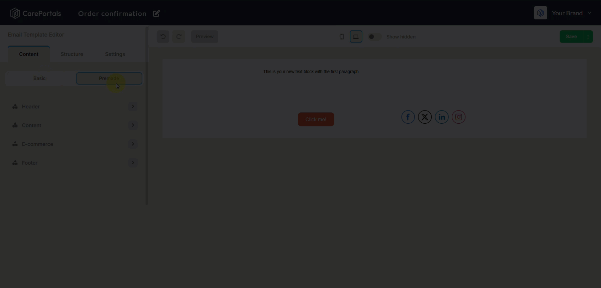
Navigate to the Content tab on the left sidebar.
Select Premade.
Browse the available layouts (e.g., Headers with Logos and Social Icons).
Drag and drop your chosen component onto the canvas.
Once you’ve added the component to your template, you can change elements like text, labels, and layout to make it work in your design.
Image & Logo Customization
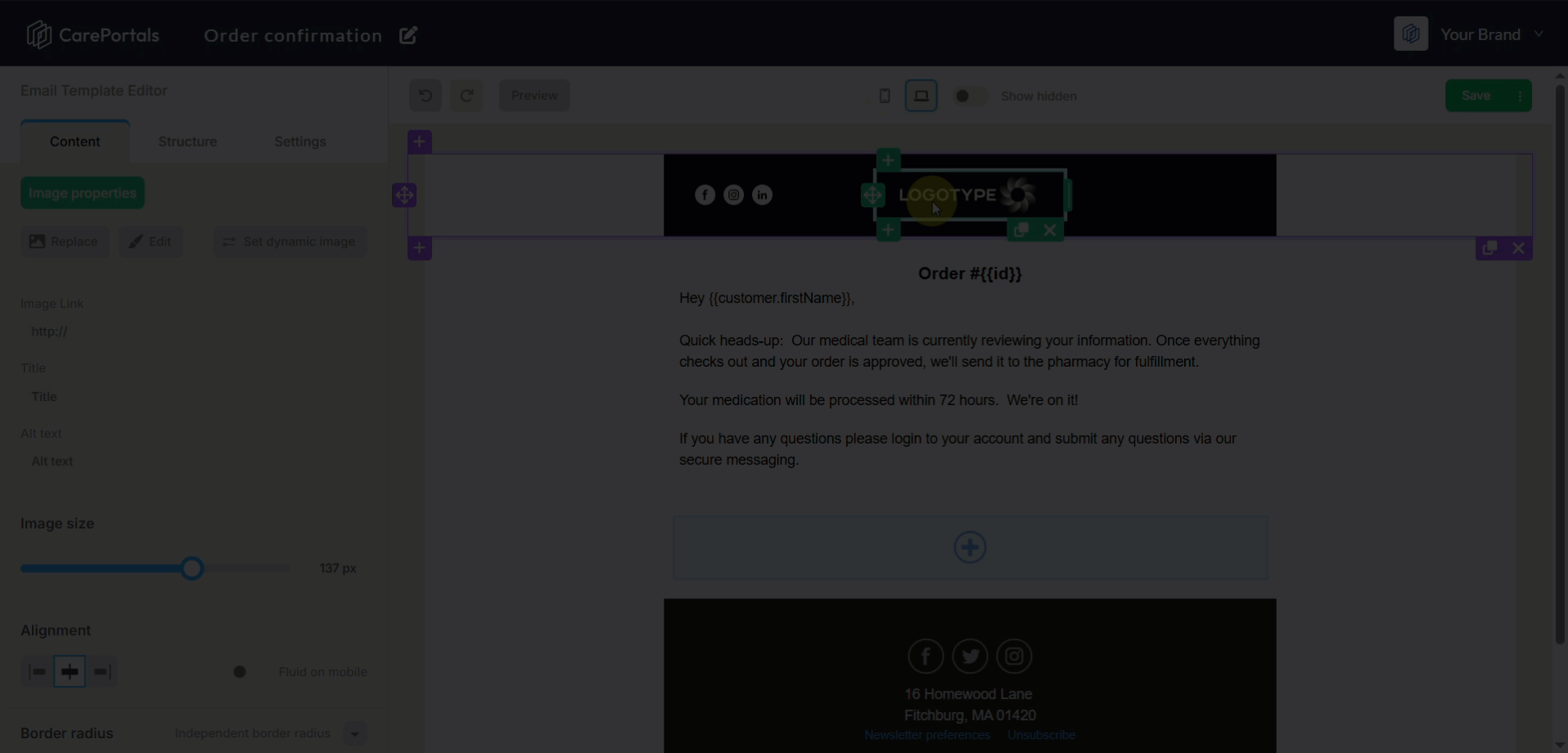
Click on an image or logo to open the Image Properties menu.
Basic Management
Replace: Swap the placeholder with your own file via the File Manager.
Edit: Open the built-in image editor for quick adjustments.
Set Dynamic Image: Use a variable URL for personalized images.
Image Link: Assign a URL that opens when the recipient clicks the image.
SEO & Accessibility
Title: Set the hover text for the image.
Alt Text: Enter a description of the image (essential for accessibility and when images fail to load).
Styling & Layout
Size: Manually adjust the width in pixels (px).
Alignment: Left, Center, or Right.
Margins: Adjust spacing (Top, Left, Bottom, Right) independently.
Borders: Set a Border Radius to round image corners. You can round corners independently (e.g., top-left only) for creative shapes.
Fluid on Mobile: Toggle this to ensure the image resizes automatically to fit smaller mobile screens.
Social Icons Setup
Click on the social media block to access the Social Networks configuration.
Managing Platforms
You can control which icons appear and in what order:
Visibility: Use the eye icon next to a platform name to show or hide it.
Reorder: Drag platform names to change their sequence.
Add Custom: If your platform isn't listed, select Add Custom Icon to upload a specific logo.
Supported Platforms Include:
Standard: Facebook, Instagram, LinkedIn, YouTube, Pinterest, Twitter
Modern: TikTok, Snapchat, Threads, X, Spotify, Apple Pod
Icon Styling
Style: Select the visual theme (e.g., Rounded Black, Color, Outline).
Size & Padding: Control the size of the icons and the space between them.
Alignment: Center, Left, or Right align the icon group.
Margins: Add independent spacing around the entire icon block.
Structure & Container Settings
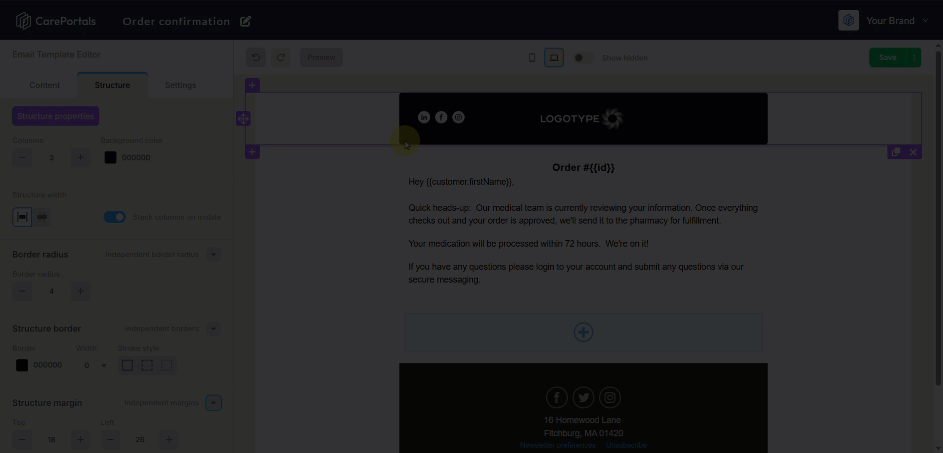
To edit the background and layout of the entire block (not just the content inside), click the container background to open Structure Properties.
Background & Colors
Background Color: Use the color picker to set a solid hex color (e.g.,
#E1EDEE).Background Image: You can insert a static or dynamic background image. Not all email apps support background images. It is highly recommended to set a similar background color as a fallback to prevent display errors.
Borders & Dimensions
Structure Width: Define the maximum width of the content area.
Borders: Define border width, stroke style (solid, dashed), and color.
Corner Rounding: Use Independent Border Radius to smooth out the corners of the container (as seen in the video, creating a pill-shaped header).
Spacing
Margins & Padding: Use independent controls for Top, Left, Bottom, and Right spacing to ensure the component sits correctly relative to other blocks.
Mobile Responsiveness & Display Logic
Ensure your email looks perfect on both desktop and mobile devices using these settings found in both Structure and Content properties.
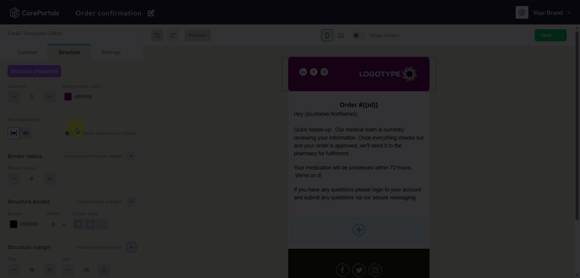
Stack Columns on Mobile: When enabled, multi-column layouts (like a logo next to text) will stack vertically on mobile devices for better readability.
Fluid on Mobile: Ensures images scale down rather than being cut off.
Visibility Toggles:
Hide on Mobile: The element will disappear when viewed on a phone.
Hide on Desktop: The element will disappear when viewed on a computer.
▶️ Toolbar Actions

Undo / Redo Arrows
If you make a mistake or simply don't like a change you've made, look for the Undo arrow (curved arrow icon pointing left) in the top toolbar. Click it to immediately revert your last action.
If you change your mind again or want to restore what you undid, click the Redo button (usually the opposite curved arrow pointing right) to reapply the change.
Preview Button: Switches the screen to a "live" mode. This hides the editor grids and toolbars, showing you exactly what the recipient will see.
Device Display
Desktop Icon (Landscape): Displays the standard computer view (currently highlighted in blue when selected).
Mobile Icon (Portrait): Switches the canvas to a narrow mobile width. Use this frequently to ensure your text is readable and images are sized correctly for phones.
Show Hidden: See elements you have set to Hide on Mobile or Hide on Desktop within the editor. If an element seems to have disappeared while you are editing, check this toggle.
Next Steps
Now that you know how to add and modify premade components, you are ready to put it to work. Explore these related features to integrate your design into your operations:
How to Create Email Templates: Learn how to create branded messages to send to your patients for different events, such as order confirmations or subscription renewal reminders.
Understanding Promotions and Coupons: Discover how promotions and coupons differ and which one best fits your goals for offering patient discounts.